UW Medicine
Pathway Prominence in the Homepage Hero Section
Business Goal
UW Medicine wanted to increase the prominence of key actions within the homepage hero section.
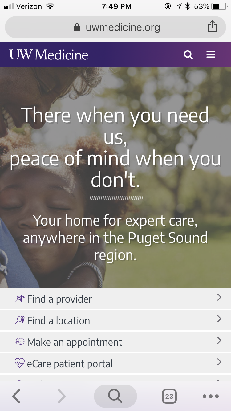
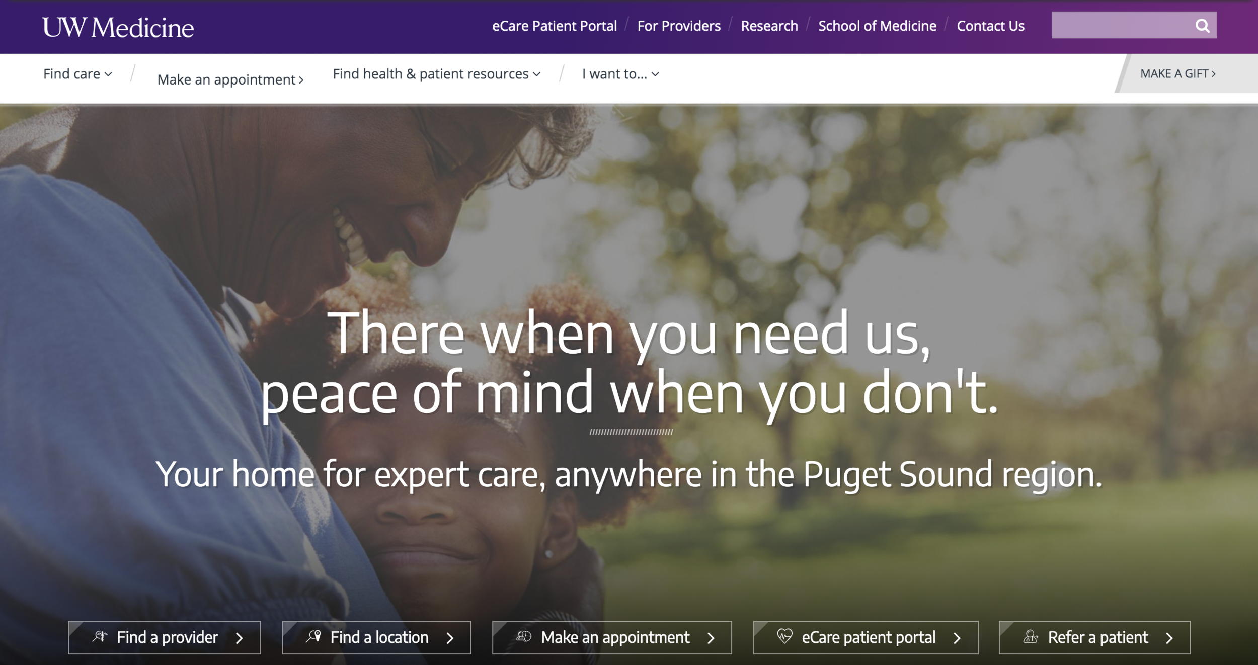
Page Hero Area Before Redesign
Context
The available action pathways within the current homepage section were not visually prominent. They were small in size and de-prioritized compared to the headline above it. Additionally, the headline text covered the subjects within the hero photo on all form factors. Thus, this project also represented an opportunity to create an information structure within the hero image that balanced function and form — creating a place where the headline and actions could be highlighted while also creating a standard for photography selection going forward.
Hypothesis
If we increase prominence of key actions within the homepage hero section, then click-through rate on within the homepage hero will increase because patients will find the actions they seek more easily.
My Impact
I served as the sole user interface designer tasked with visualizing the more prominent user actions. Also, as the sole user experience designer on the project, I mapped the available user paths and collaborated closely with the engineering team to implement and review the designs.
This effort increased clickthrough by 3.6% on the appointing CTA in the homepage variant test compared to the control. (A/B test results)
Process
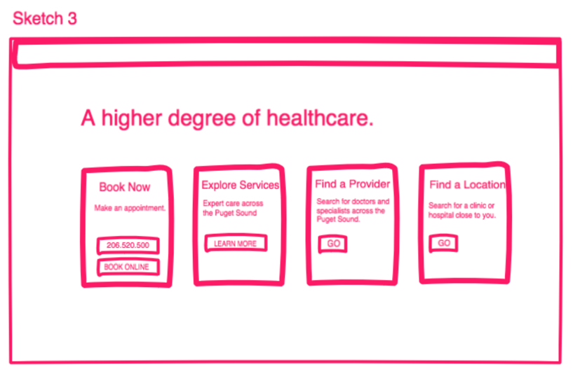
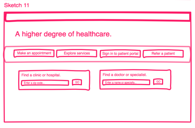
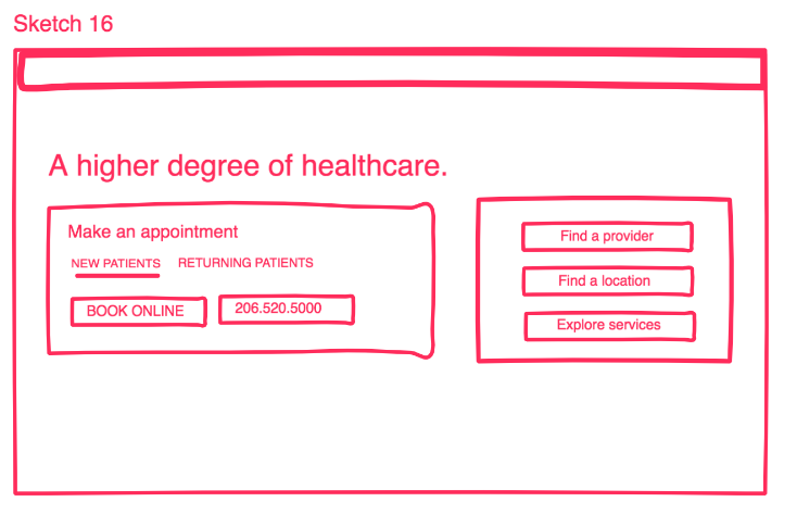
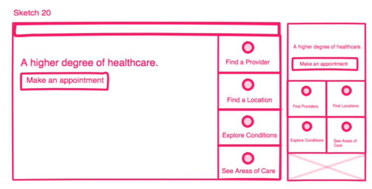
Map the user paths to include:
Make an appointment
Find urgent care
Find a location
Find a doctor
Iterative sketching, concepting and design reviews
I sketched independently, completed a dot ranking exercise with other members of the design team, presented revised concepts to our creative director and digital strategy director and lastly presented the final concepts to A/B test to our director of strategic marketing.
I also presented my work at the weekly visual design review and also at our team’s Agile sprint grooming session to discuss feasibility and acceptance criteria for the UX/UI feature enhancement.
A/B Testing
To validate our hypothesis that more prominent call-to-actions would increase click-through, we A/B tested the current experience against the proposed. I collaborated with a front-end developer to build the test in the Google Optimize testing platform.
Responsibilities
Wireframing
High-fidelity UI design
Participation in all Agile ceremonies as an embedded member of the development team
UX/UI review before code release
The screens were designed in Adobe XD.